
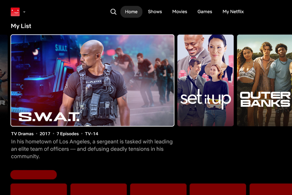
Unless you click on Netflix with a vision in mind — starting The Four Seasons, catching the new Black Mirror episode, a Maestro rewatch — the sheer amount of rectangles onscreen can be overwhelming, and choice paralysis is inevitable. While the site’s layout initially meant to invoke the nostalgia of walking through a video-rental store, trying to figure out what to watch became the watching in and of itself. But Netflix doesn’t want you to scroll — not really: It wants you to be watching its original content. For the first time in a dozen years, Netflix will be redesigning its home page with the hopes that you stop scrolling and start watching.
Netflix will start rolling out a new home page as soon as next week and over the course of the next several months on the service’s television app. The design will also have fewer options available to the user on the screen but more video available so people can get a feel for what they might want to press play on. The new layout — the company’s nickname for which is “Eclipse” — will present viewers with a bigger image when they hover over a title and more information and badges like “highly rewatched” or “Oscar nominee,” per the New York Times. Netflix co–chief executive Greg Peters said the service’s recommendation algorithm will now work quicker to find options similar to what viewers have been searching for; Netflix’s chief product officer, Eunice Kim, likened the experience to the all-knowing TikTok “For You” page’s “understanding” of the user (though if Netflix really understood its users, however, it would let them keep sharing their passwords free of charge). Given the site’s influence over the rest of the streaming economy, the other major streamers may soon fall in line with new layouts of their own. For those who just love the pure, unadulterated sensation of scrolling on their TV, however, there’s still YouTube.
Related


For Sale! 2016 Sea Ray 350 Sundancer – $180,000
Reel Deal Yacht is pleased to feature a meticulously maintained 2016 Sea...

Trump’s Acceptance of Qatari Plane May Present National Security Risks: NPR
The Controversial Gift: Qatar’s Offer of a Luxury Aircraft to Trump On...

Struggling Sergio Garcia says he’d decline playing for European Ryder Cup team right now if invited
Sergio Garcia has appeared in 10 Ryder Cups and amassed more points...

Arsenal secures return to Champions League on day of farewells for Everton and Vardy
Arsenal has sealed its place in next season’s Champions League. Nottingham Forest...

The NBA’s final 4 is set: Thunder, Knicks, Wolves and Pacers remain, and parity reigns again
The parity era continues in the NBA. The New York Knicks haven’t...
Leave a comment