Crafting a New York State of Mind: The Vision Behind the World Cup Campaign
Embodying the City’s Essence
In a city where every street corner pulsates with energy and cultural diversity, building excitement for an international event like the World Cup among 8.5 million New Yorkers demands more than mere promotional tactics. It requires a nuanced understanding of the city’s soul—a challenge embraced by Arsh Raziuddin, the creative director behind New York City’s vibrant World Cup campaign.
At just 34 years old, Raziuddin has emerged as a formidable force in design, transforming the city’s tourism branding through her innovative visual identity that resonates with both locals and tourists. Her approach combines deep research into New York’s iconic colors and symbols with a fresh, joyful aesthetic that captures the essence of the city.
Designing for Inclusivity
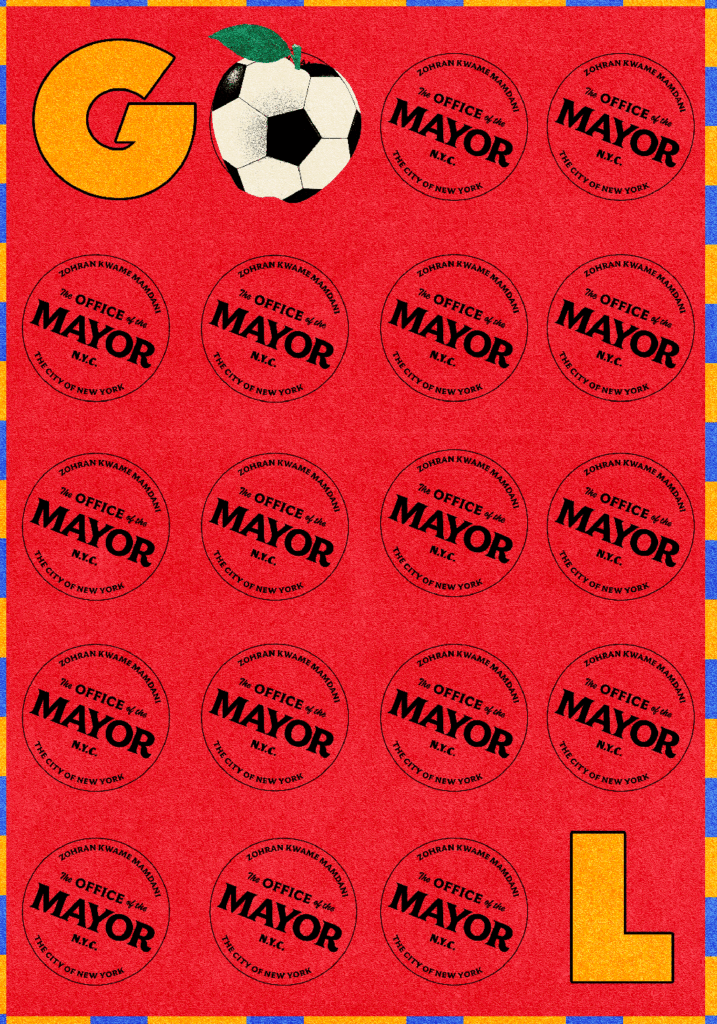
The campaign, aptly titled “Where the World Comes to Play,” aims not only to attract visitors but also to celebrate the rich tapestry of New York’s communities. This initiative is part of a broader strategy by Mayor Zohran Mamdani’s administration, which seeks to redefine how mega-events like the World Cup can foster inclusivity rather than serve merely as economic spectacles.
“The World Cup is one of those rare moments when a city gets to see itself differently,” Raziuddin explains. The campaign’s design reflects this philosophy, incorporating elements that resonate with all New Yorkers, from children to elders, without falling into the cliché of forced unity.
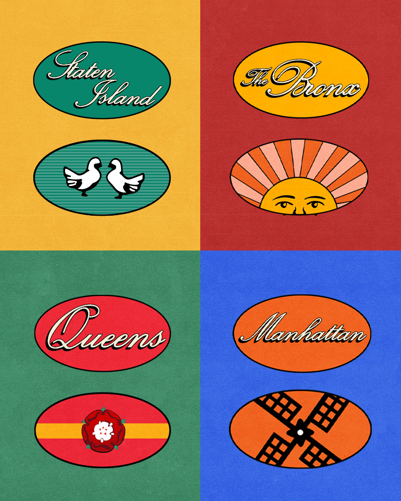
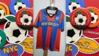
Symbolism and Storytelling
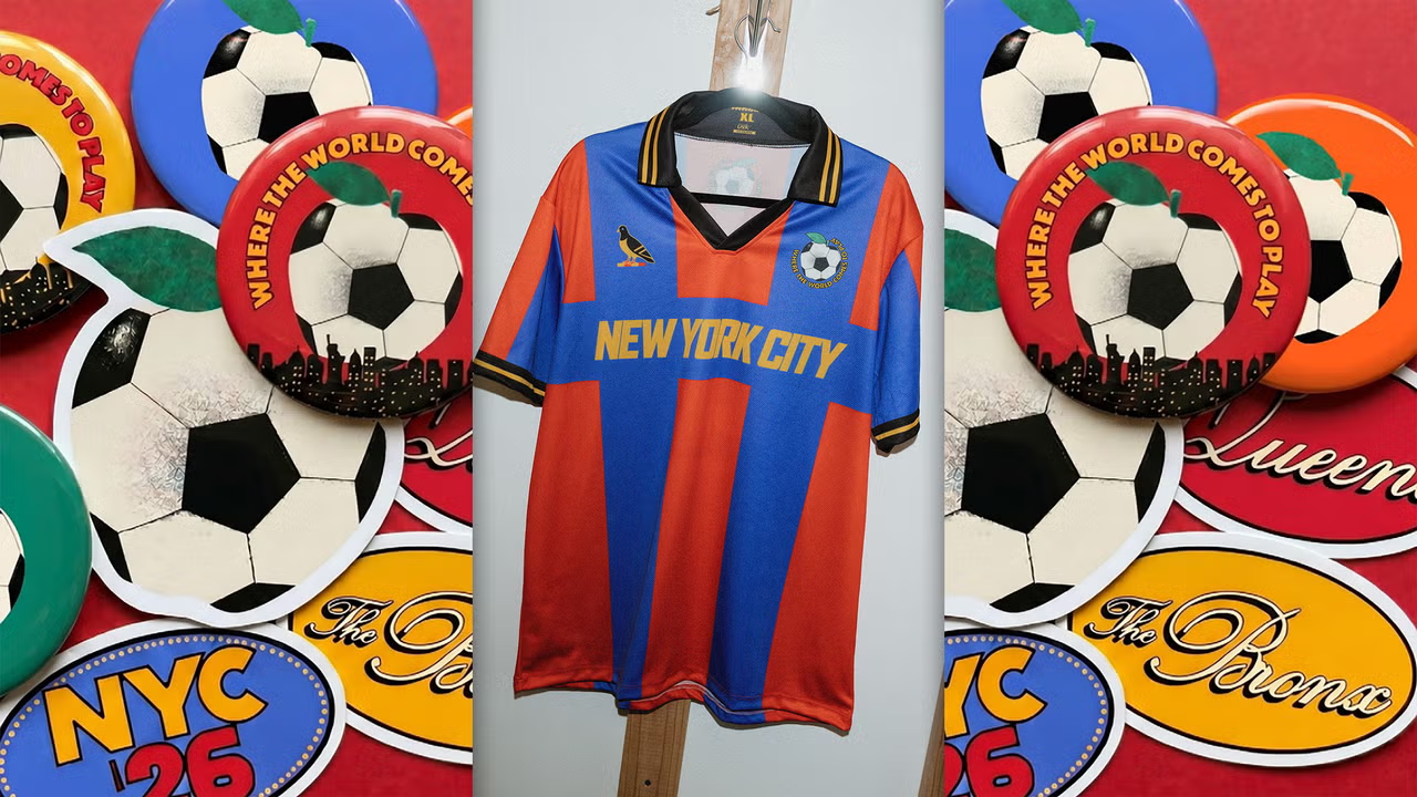
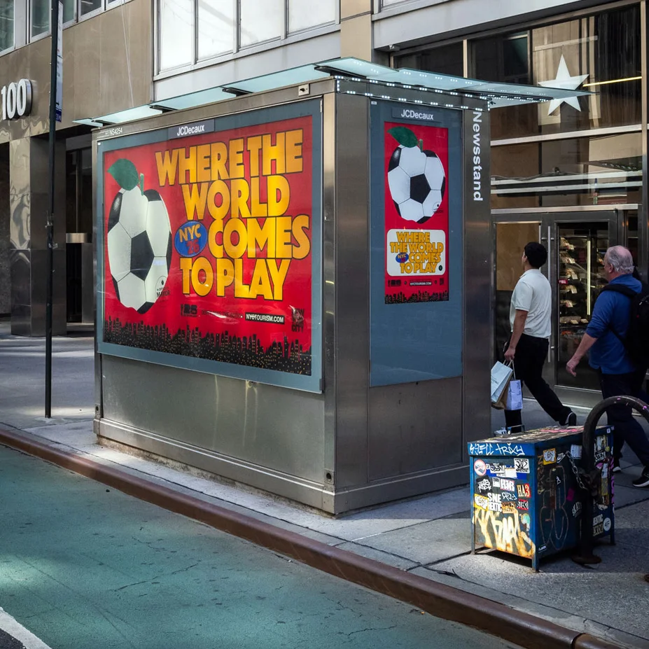
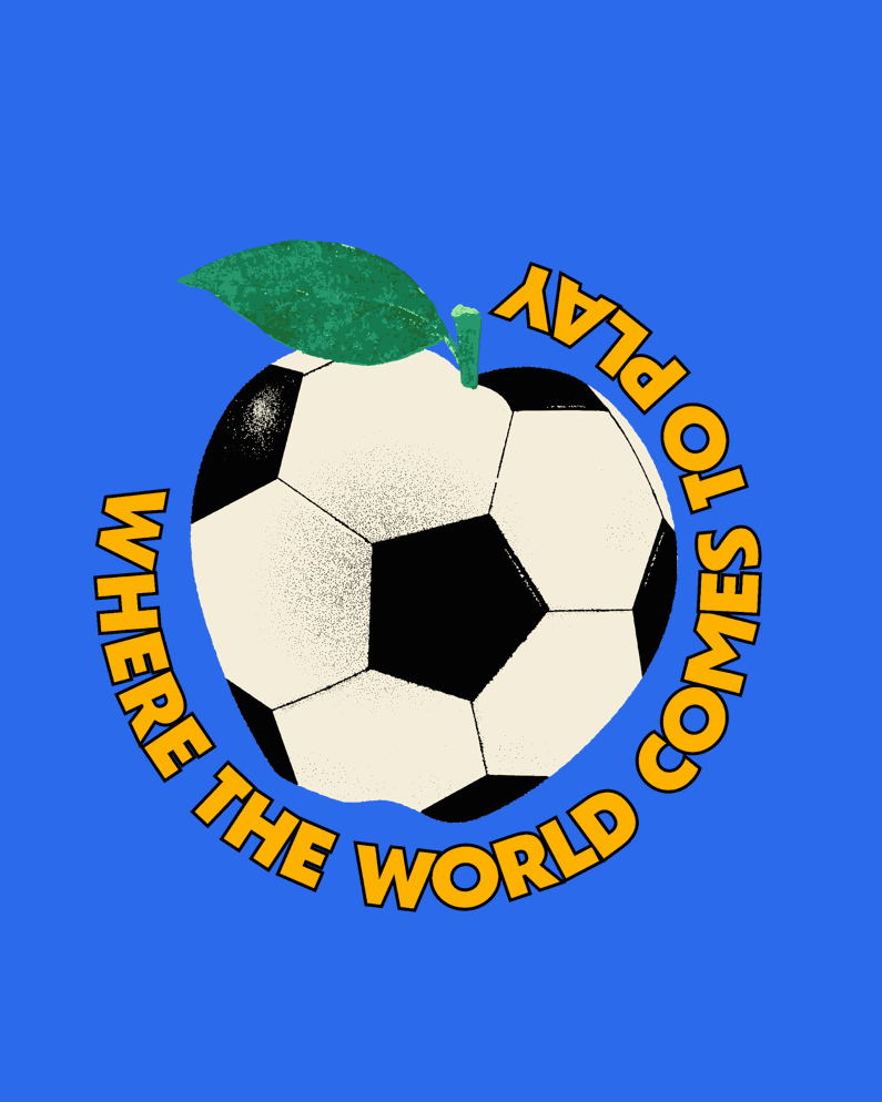
One standout feature of the campaign is an apple whose skin evokes the familiar pattern of a soccer ball. This clever design choice symbolizes not just the iconic “Big Apple” but also the universal appeal of soccer. Raziuddin’s iterative process led her to blend various New York symbols, including taxis and bridges, with elements from the world of soccer, creating a visual narrative that speaks to both locals and visitors alike.
“How do you put the thing in the thing?” she muses, referencing the approach she learned from her mentor, Peter Mendelsund. By meticulously listing and connecting symbols, Raziuddin crafted an emblem that is instantly recognizable yet fresh, allowing the apple to represent both the city and the global event.
A Citywide Canvas
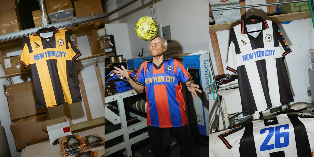
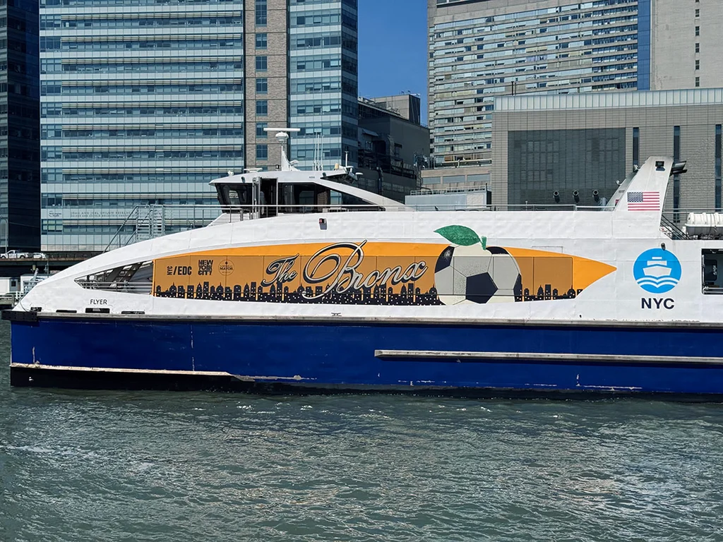
The scale of the campaign necessitated a design that could transcend various mediums, from subway signage to merchandise like jerseys and souvenir cups. Raziuddin worked closely with her team to ensure a cohesive brand identity that could be adapted across different platforms, making it an integral part of the city’s fabric.
The campaign’s color palette draws inspiration from the everyday sights of New York, capturing the vibrancy of subway green, the warmth of red shopping bags, and the iconic yellow of taxis. Raziuddin’s vision extends beyond mere aesthetics; it’s about creating an inclusive atmosphere that invites everyone to join in the celebration.
Nostalgia Meets Modernity
Nostalgia plays a significant role in Raziuddin’s design approach, evoking memories of shared experiences tied to the World Cup. “Major events bring back memories,” she reflects, linking personal stories to the broader narrative of the city. This sentiment is particularly potent in a city known for its transient nature, where collective experiences can foster deeper connections among its residents.
A New Era of City Branding
As Raziuddin’s campaign rolls out across the city, it signals a new era of city branding that prioritizes inclusivity, community, and the celebration of shared identity. The feedback has been overwhelmingly positive, with many expressing joy and pride in the campaign’s visuals, further cementing its role as a unifying force in the city.
With a vision that aligns closely with Mayor Mamdani’s progressive ideals, Raziuddin’s work exemplifies how effective design can transform public spaces and foster a sense of belonging. As the World Cup approaches, New Yorkers are not just spectators; they are active participants in a collective celebration of their city’s vibrant culture.
Editorial note: This article was created by A Bit Lavish Miami’s Magazine as an original editorial reinterpretation based on publicly available reporting. Original source: fastcompany.com. Read the original article here: https://www.fastcompany.com/91558789/new-york-city-world-cup-campaign-branding.
Images are used for editorial reference with source credit. If an image requires correction or removal, please contact A Bit Lavish.


The Financial Connection: Unlocking Lasting Happiness in Relationships
Explore how open discussions about finances can enhance intimacy and strengthen relationships,...

The Hidden Value of Uninterrupted Focus in the Modern Workplace
Explore how cultivating deep work and intentional communication can lead to greater...

Navigating Career Stagnation: A Path to Renewal
Explore strategies to overcome career stagnation and reinvigorate your professional journey in...

Rethinking the Risks: The Alarming Trend of Alcohol Consumption Among Pregnant Women
A deep dive into the rising trend of alcohol consumption among pregnant...
Leave a comment