Rediscovering Argentina’s Forgotten World Cup Signage: A Masterclass in Design Innovation
A Hidden Gem of Design History
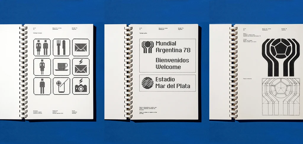
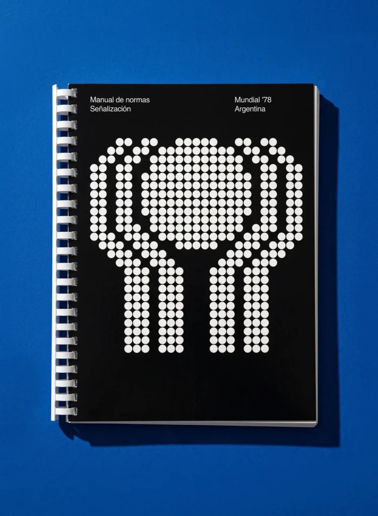
The 1978 World Cup in Argentina not only showcased some of the best football talent but also introduced an innovative approach to signage and wayfinding, which has long been overlooked. In a time characterized by political upheaval and societal challenges, the design team behind the event created a modular and economical signage system that not only facilitated navigation but also reflected a cultural moment. Years later, this ingenious work is finally garnering the attention it deserves through a newly released book, Manual of Standards: Signage, FIFA World Cup ’78 Argentina.
Crafting a Cohesive Experience
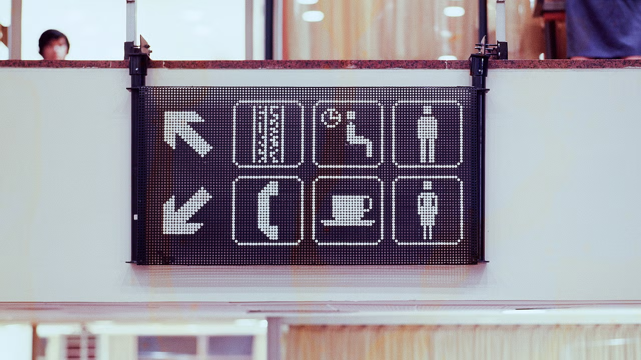
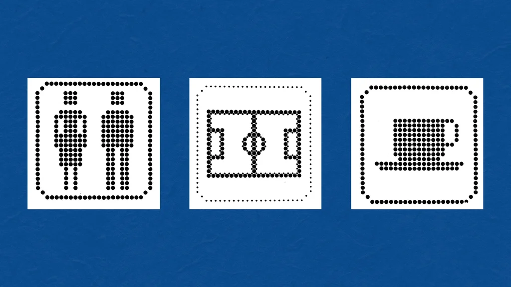
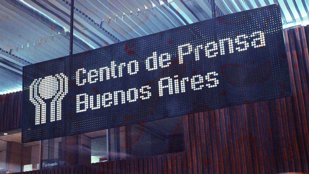
The task at hand was monumental: design an effective and standardized wayfinding system across six venues for one of the largest sporting events in South America. The solution was a groundbreaking approach named Puntograma, a term that resonates with the visual language of simplicity and modularity. This grid-based methodology utilized dark green perforated steel panels, ingeniously assembled with white polypropylene buttons to form letters, symbols, and images. The design not only prioritized functionality but also embraced an aesthetic that was both playful and sophisticated, reminiscent of a Lite-Brite toy.
Resilience in Design
Despite its brilliance, the Puntograma system has largely faded from collective memory, a result perhaps of the military dictatorship that overshadowed Argentina during the late 20th century. The prevailing sentiment was one of anti-nostalgia, an emotional distancing from the past. However, publisher Flecha Books seeks to revive this narrative, illuminating the creativity that emerged during a tumultuous period in history.
From Creation to Recognition
Designed by the renowned team of Carlos Méndez Mosquera and Gus Bonsiepe at the Argentine studio MM/B, the signage was part of a broader industrial design effort that included everything from seating arrangements to stadium equipment. This comprehensive graphic system even featured a custom typeface, a refined adaptation of the sans serif Univers, and an array of pictograms for essential amenities such as restrooms and food services. Each stadium was uniquely branded, drawing inspiration from its geographic location—waves for Mar del Plata, mountains for Córdoba, and grapes for Mendoza.
Bridging Past and Present
As designers today grapple with the implications of digital technology on wayfinding, the 1978 World Cup’s signage offers a refreshing reminder of the power of simplicity and modular design. It underscores the importance of accessibility in public spaces, a theme that resonates deeply within Miami’s vibrant cultural landscape. Our city, known for its dynamic blend of influences, can draw valuable lessons from this historical example, as it continues to evolve in the realm of urban design and public art.
A Legacy Restored
In a world increasingly dominated by digital interfaces, the revival of Puntograma serves as a testament to the enduring value of tactile, user-friendly design. As Flecha Books makes this remarkable work available for public consumption, it invites us to reflect on the past while inspiring future generations of designers to explore the intersection of functionality and creativity. The resurgence of interest in this long-forgotten design not only honors its creators but also enriches the narrative of design history, reminding us that innovation often emerges from the most unexpected places.
Editorial note: This article was created by A Bit Lavish Miami’s Magazine as an original editorial reinterpretation based on publicly available reporting. Original source: fastcompany.com. Read the original article here: https://www.fastcompany.com/91564346/this-long-forgotten-signage-from-argentina-is-world-cup-design-at-its-best.
Images are used for editorial reference with source credit. If an image requires correction or removal, please contact A Bit Lavish.


Yordan Alvarez Leads 2026 Fantasy Baseball Rankings as Ronald Acuña Jr. Makes Top 10 Return
The latest fantasy baseball rankings reflect shifting player dynamics, influencing global sports...
Injury Updates for Sparks-Sky Game: Key Players Kamilla Cardoso and Skylar Diggins Questionable
The status of key WNBA players Kamilla Cardoso and Skylar Diggins could...

Redefining Design: How Inclusive Solutions Elevate the Everyday
Exploring how designing for specific challenges leads to innovations that benefit everyone,...

Navigating the Smoke: The Growing Challenge of Wildfire Air Quality
Explore the implications of Canadian wildfires on air quality in urban centers,...