Transforming the Brand Landscape
In the ever-evolving world of bioscience, branding often takes a backseat to scientific rigor. However, when the Allen Institute, founded by the late Microsoft cofounder Paul Allen, sought a rebranding, they turned to design innovator Neville Brody. Known for his work with global giants like Coca-Cola and Nike, Brody approached the Allen Institute’s identity not just as a logo redesign but as a holistic platform that encapsulated the institution’s expansive mission.
The Heart of Discovery
Established in 2003, the Allen Institute has grown from a single laboratory focused on the intricacies of the human brain to a multifaceted research entity addressing critical issues such as addiction, cancer, and long COVID. Its commitment to open-source research has made vast amounts of data—from over 34 million brain cells—accessible to the scientific community and beyond. This ethos of openness and collaboration was central to Brody’s reimagining of the institute’s visual identity.
Breaking Down Hierarchies
Traditionally, a logo serves as the cornerstone of brand identity, with all other elements radiating outward. However, Brody challenged this notion, opting instead to dissolve the conventional hierarchy. His team crafted a cohesive visual language that is both adaptable and robust, allowing the logo to emerge organically from this foundation. “It’s about articulating the right visual grammar and ensuring it scales without breaking,” Brody explains, highlighting a design philosophy grounded in flexibility and consistency.
A Fluid and Vivid Identity
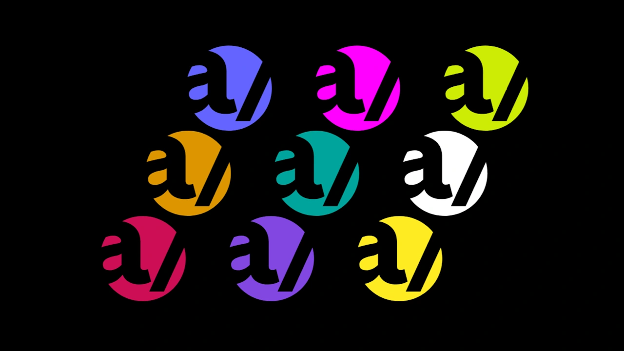
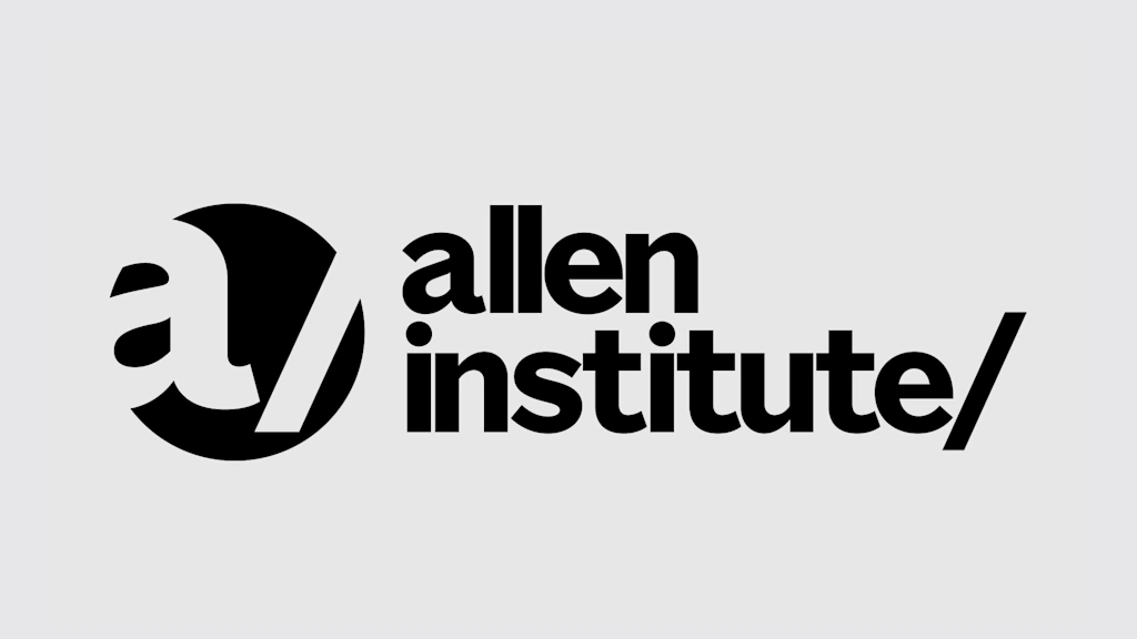
The resulting brand identity is a vibrant tapestry that reflects the institute’s core values—boldness, curiosity, and risk-taking. Central to this new identity is a logo that encapsulates the spirit of inquiry and discovery. Featuring a circular lens with a playful lowercase ‘a’ cutout, it conveys an inviting and approachable presence, contrasting sharply with the often sterile and corporate aesthetics found in the bioscience sector. Accompanied by a lowercase wordmark, this design choice evokes a sense of friendliness and accessibility.
A Palette of Possibilities
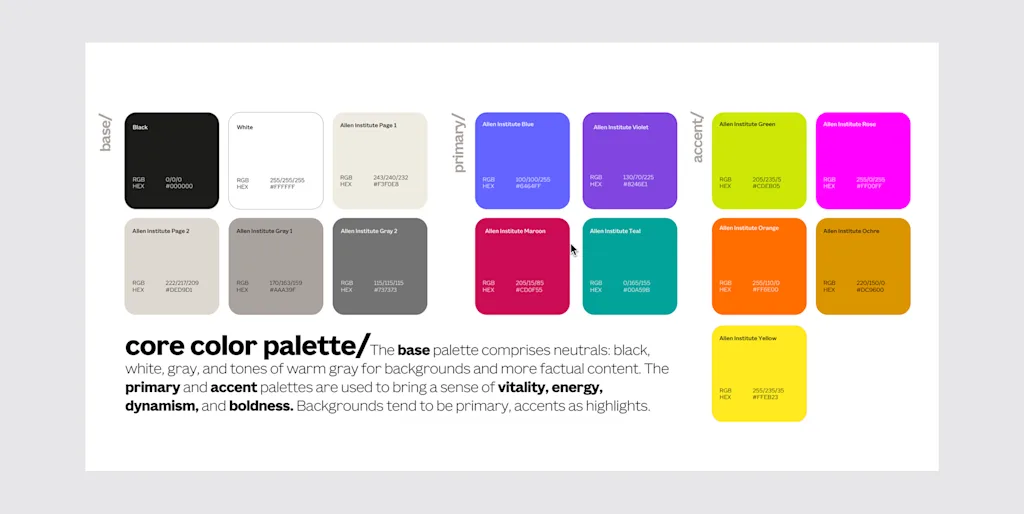
Brody’s choice of color palette further distinguishes the Allen Institute from its peers. Rather than adhering to the conventional blues and greens typical of the field, the new branding embraces a dynamic array of colors. The foundational colors of black, white, and gray are accented with saturated hues such as magenta, violet, and a teal reminiscent of healthcare scrubs. Bright accent colors—including a lively yellow, electric green, and neon pink—inject vitality and energy into the brand, making it visually striking and memorable.
Design Principles in Action
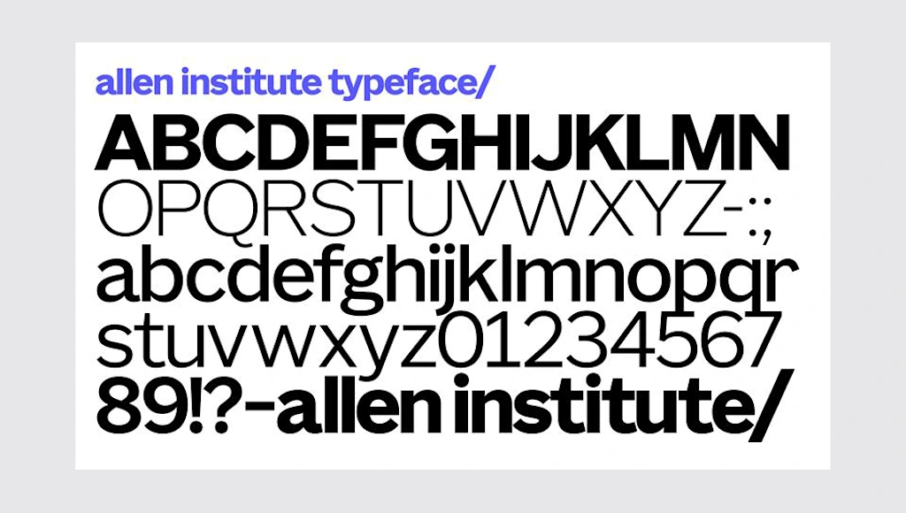
Drawing from his background in editorial design, Brody emphasizes the importance of print principles in the digital age. This includes the strategic use of white space, commissioning original photography that immerses viewers in the narrative, and employing distinctive typography to create an engaging visual experience. “What we’ve created with the Allen Institute is graphic and dynamic,” Brody asserts, noting that every design element serves a functional purpose rather than merely decorative. This approach not only enhances the brand’s visual identity but also communicates its mission effectively.
Conclusion: A Model for the Future
The rebranding of the Allen Institute serves as a compelling case study in how innovative design thinking can elevate a scientific organization’s profile while remaining true to its foundational mission. As Miami continues to position itself as a hub for innovation and creativity, the principles demonstrated through this transformation echo throughout the region’s burgeoning bioscience and tech sectors. By embracing boldness and fluidity in branding, organizations in Miami and beyond can cultivate identities that resonate deeply with their audiences and foster impactful collaborations.
Editorial note: This article was created by A Bit Lavish Miami’s Magazine as an original editorial reinterpretation based on publicly available reporting. Original source: fastcompany.com. Read the original article here: https://www.fastcompany.com/91534221/allen-institute-rebranding-neville-brody.
Images are used for editorial reference with source credit. If an image requires correction or removal, please contact A Bit Lavish.


Strategic Escapes: The Art of Vacationing as a Solopreneur
Explore the essential strategies for solopreneurs to effectively plan vacations without sacrificing...

Navigating the Ethical Frontier: Claude’s Evolution in AI Agency
Exploring the implications of agentic AI through Amanda Askell's insights on Claude,...

Reimagining the Office: From Mandate to Magnet
Explore how businesses are redefining the role of the office as a...

Harnessing Creativity: A New Paradigm for Business Leadership
Exploring how applied creativity can redefine business success and leadership in the...